I look and usually don’t click unless I want to read about the distro.
2 Likes
OK, information… same as me.
If we are all like that, it looks like hits per day is about people wanting to know about a distro, not people already using a distro.
Think most of us do that, from our own newsletter I quite often click to get more eventhough i will not use the selected item. I use YouTube on my tablet and quite often I am taken to videos I have no interest in as my finger is to close to the screen and triggers the action, problem is once you do that it registers an interest so you get more similar stuff
OK information plus accidental.
That still does not explain the 2 populations in my histogram.
1 Like
Am I correct in thinking this table shows that in the beginning of last month there was more interest than at the end of the month?
1 Like
No , I dont think it shows that . Its data is the average number of hits per day over a month.
The histogram shows there are a lot of distros in the range 10-50 hits per day, and the remaining distros are spread out over 50-1000 hits per day , with a peak at about 100 hits per day.
I am suspecting that the 10-50 group might be webcrawler hits, so the real user data would be that beyond 50 hits, with a few subtracted off to allow for crawlèrs and bots.
We shall see. I am looking further.
1 Like
It looks like the histogram of hits per day across distros varies , depending on how many months it is averaged over
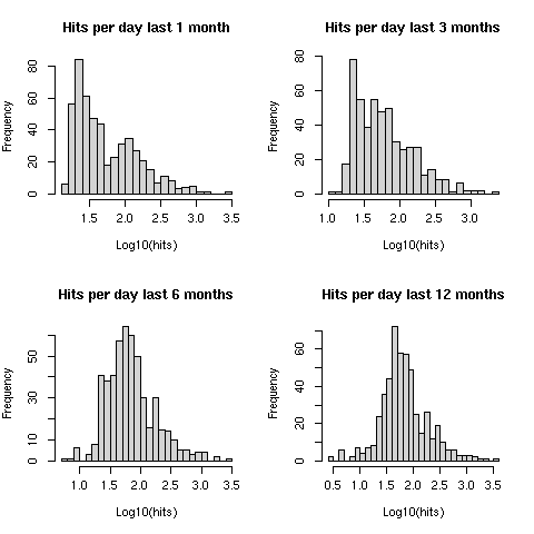
That large number of distros with 10-50 hits per day disappears as you average over a longer number of months.
If you average over 12 months, the distribution looks to be lognormal, with no hint of two peaks.
It is the same 509 distros in each histogram … we are not witnessing an influx of new distros .
What we have is a whole group of about 250 distros that have a lower than average hits per day in the last 1 month … in the last 12 month average they have moved up to about 60-100 hits per day.
I can not explain that yet. Any ideas?
I would like to know if this last 1 month is peculiar … I have to wait for next month’s data to see .
If it is peculiar, it is just being swamped in the averaging over longer terms.
2 Likes
Not knowing what the original question was it is kind of hard to interpret what the table indicates. Easiest to most difficult to configure? My first distro? The most xyz distro?
2 Likes
I agree. Distrowatch give a user rating for each distro but do not say what aspect of the distro is being rated.
We would have to assume it is a vague overall rating.
1 Like