This morning I upgraded my PC from LM 22.2 to 22.3. I did not perform a fresh install.
The upgrade took only about 5 minutes. No problems to report so far.
Well, one very small problem. Maybe it was the dark screen or my eyes.
I could not see the box to check for “yes” I wanted to install the updated release.
Rolling my mouse around and I finally did see it.
No matter how fashionable, the popular dark background in many distros is less than friendly to my elderly eyes. I’m trying to figure out how to set up the background to a nice, soft ivory or cream, with maybe brown or olive text. The rest of you will get here in a few years and then you’ll understand.
I hate the dark background, thought it was just me who was out of fashion but perhaps it is also my age and eyesight. Although 3 years ago I had a cataracte surgery in one eye and the difference that made to my vision is amazing. I can see without glasses and now can tell the difference between Boys and girls when swimming !, you laugh at that but for a long time could not seperate dark chest hair or full bathing suits. When swimming, not that it makes much difference it only when I pass in the pool at speed.
I have worn glasses all my life and no matter what surgery I have one eye which will never be corrected also I needed to be strapped to the bed as I was so scared of the surgery
In Xfce (and I think most DE’s) you can choose a plain color background in the same menu where you choose a background image.
I like a plain dark red. Red is easy on the eyes… it is like the redshift function that makes the background redder at night.
You may also be able to adjust your screen with buttons. Not in a laptop though.
I am assuming you do not mean ‘dark theme’… that is a different thing.
Same with me. My two eyes only coordinate when I concentrate hard like when reading. When I relax I see double. It makes driving very tiring, because I have to concentrate for long periods. I do my computing in short 1 hour stints.
OK , I understand.
You have to find a theme that does that .
Find a DE that offers lots of themes.
I like the idea… I will have a browse around my systems which are mostly gtk and xfce.
I had a look at MX, Devuan, AntiX, Artix.
The big problem seems to be that themes do not promulgate to all types of windows.
I would expect that with a minimal distro like Void or Gentoo, but not with fully configured distros like MX.
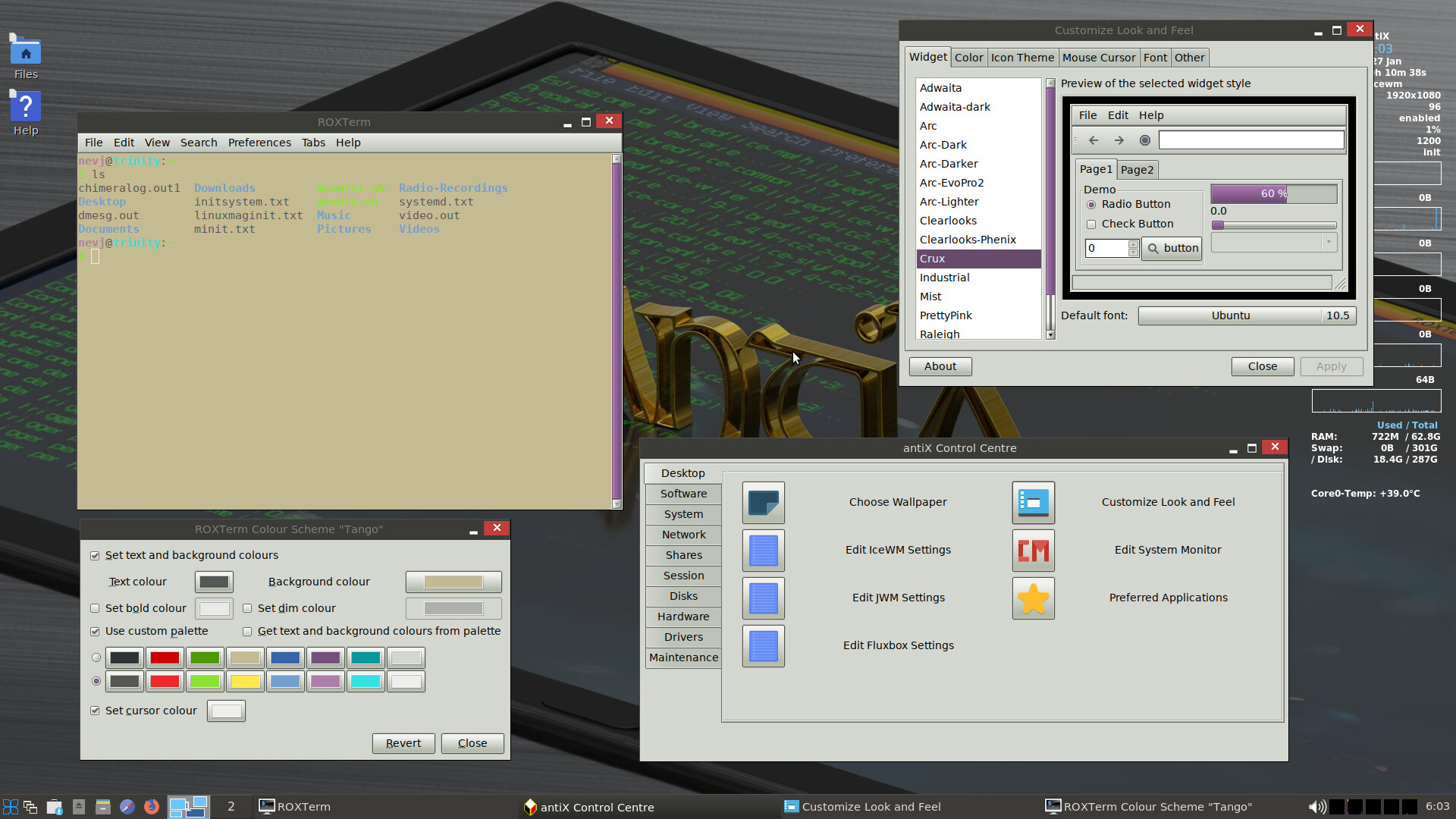
For example , in antiX I set a theme called ‘Crux’ and it made the Settings window and the Control Centre window have a light gray background, but the terminal window stayed where I had set it in the Terminal Preferences, at a cream background.
I am sure there are distros where the whole thing is coordinated?
Does anyone know?
I found this
" When you run a program, prepend GTK_THEME='NAME' where ‘NAME’ is the name of the theme you want to use, such as ‘Adwaita’ (which is what I used with Firefox).
So, for example: instead of running firefox run something like: GTK_THEME='Adwaita' firefox
As you might’ve guessed, this only works with GTK programs, but there’s probably a Qt alternative."
Would be nice if Kvantum could do GTK and not just qt apps. I use Kvantum for clipgrab app I use for downloading videos from YouTube. As default Clipgrab is very light, blinding like Google’s home page. So I use Kvantum and qt5ct (configuration tool) to sort it out with. You can find Kvantum in Synaptic, it should also be in Software Manager too. You’ll need qt5ct too. Straight after installation reboot, as it does not work straight away properly. In Kvantum you can pick out different coloured background themes and apply them to apps. Lots of settings, but you’ll need to use qt5ct as well in conjunction, to apply the settings. You can change fonts around as well, adjust their size too inside qt5ct. Like I say it is mainly for qt apps, but there are settings for GTK apps as well.
Below is Erik Dubois from 18th June 2020 on Kvantum.
I appreciate the suggestions. I think Modicia uses gtk, but I have no idea how to manipulate it. As I’ve said before, I’m not even sure where the hood/bonnet latch is, much less what to do if I get it open.
The issue of color of text vs. background for best legibility has been studied quite a bit. There is agreement that black or dark grey text on a white or light color background is the most legible. A year or so ago I read a study from Germany that concluded black text on a white background was best for reading comprehension as well as being most legible. The current fad of dark themes is, in my opinion, being done because it’s novel. It is, however, not helpful.
I too have several polo shirts and dress shirts that are blue, my wife hates me wearing blue no idea why, everytime I get one out to wear I get the comment, “you are not wearing that !”
At work we had blue overalls… the CSIRO sky blue color. It must have stuck… all my workshirts today are sky blue. It goes with khaki pants or with jeans. No decision making. See in my avatar.
I was going to make a very sexist comment on this but thought better not, I used to iron my clothes when working, shirts and pants. But gave the iron away when I stopped work.
Na, comfort comes first. Has to be cotton . That means ironing… or just wear it as is. Wool avoids ironing but not suitable for hot climates… my grandfather used to wear flannel shirts in the blacksmith shop… because wool is not flammable.