A couple of years ago, Numix was my favorite.
These days, I use Ant theme with Pop OS icons.
Which theme and icons do you use on your Linux system?
A couple of years ago, Numix was my favorite.
These days, I use Ant theme with Pop OS icons.
Which theme and icons do you use on your Linux system?
I prefer dark themes with semi-transparent elements (can’t think of the exact theme I use right now) and paper icon theme, which you can find here: https://snwh.org/paper 
None! It’s not standard enough functionality for my tastes. All Linux window managers are essentially tweaked copies of Windows and the themes are just another way to destabilise your system. I aim for the lowest chrome, most stripped down UI possible, without doing any customisation that isn’t directly supported by the control panel.
Rule 1: If it is called ‘effect’ - turn it off.
Rule 2: If it says ‘smart’ - turn it off.
Rule 3: If it gives you an option to turn it off - turn it off.
Rule 4: If you can change your desktop background to a solid dark shade, do so.
Rule 5: If you can desaturate the window manager from the control panel, do so.
Rule 6: Stop reading Abhishek’s evil temptation to customise the UI. So tempting. So very wrong
Themes, specially the icon themes are pretty harmless. You can revert to the default without any problem, without breaking anything
Adapta-eta and Papyrus icons, not a fan of dark themes, I like some eye candy.
Breeze Dark on Q4OS KDE.
No special pref. for icon set as of yet.
Nice choice there
+1 to Danielson’s post
Adwaita would be (at present) my likely 1st choice for icon set.
Can we add a subcategory (default background themes) here?
-default ones on Q4OS KDE (Debian) are stupendous!
(enjoy having option to have different one for external monitor);
-MXLinux has some real beauties too!
-LinuxMint isn’t too bad (but i get bored after a short while).
If it is not Windows (!) then why so concerned?
I appreciate that you have strict principles but, if Linux generally is to appeal to a broader audience, why not accept that some users may wish for a more recognisable or familiar interface?
The concept is that if does not compromise the system then surely it must be a matter of choice as in your own case?
What say you?
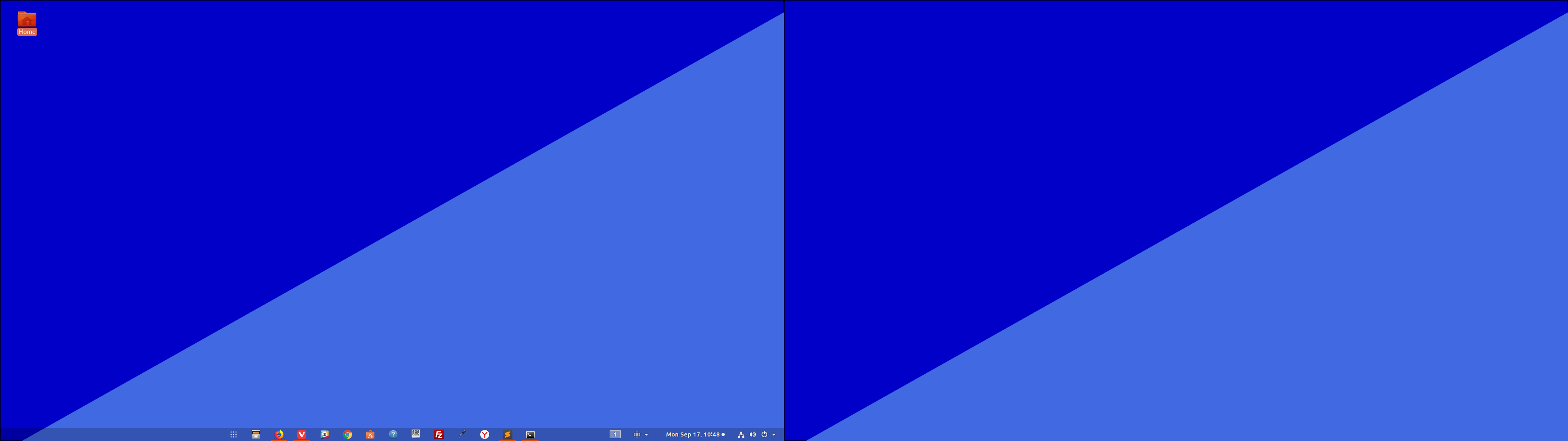
This is my dual monitor simple background theme:
<svg
  xmlns="http://www.w3.org/2000/svg"
  width="1920" height="1080"
  stroke-width="10"
  stroke-color="#ffff00"
  viewbox="0 120 1920 1080"
  style="background-color:#ffff00; z-index:42; /* NOT USED */"
>
  <rect
    width="1920" height="1080"
    style="fill:rgb(0,0,200); stroke-width:3; stroke:rgb(0,0,0)"
  />

  <path d="M 0 1110   L1920 30   L1920 1080 z"
  	style="fill:royalblue;"/>
</svg>
Communitheme with Suru icons.
buuf icons and adwaita-dark theme
Using Mint I like the Humanity Icons and love the Aque theme. Been using the Aque theme since switching to Mint, the Humanity was available before so have only used it since it was it.
Had to search for it. That’s a different looking icon set.
I am also using Paper icons ATM.
I use Adapta. Simple and clean. Won’t distract you while working.
I love Numix! But lately I’m quite into dark themes, and am currently using Arc Dark.